Schema Builder — UI Component Reference
App Version: 2.2.0 | Codebase Root: SchemaBuilder/meta_configurator/src/
This page maps every visible UI element in the Schema Builder to its feature name, description, and primary codebase module. All relative paths are from SchemaBuilder/meta_configurator/src/.
Schema Mode — UI Component Map
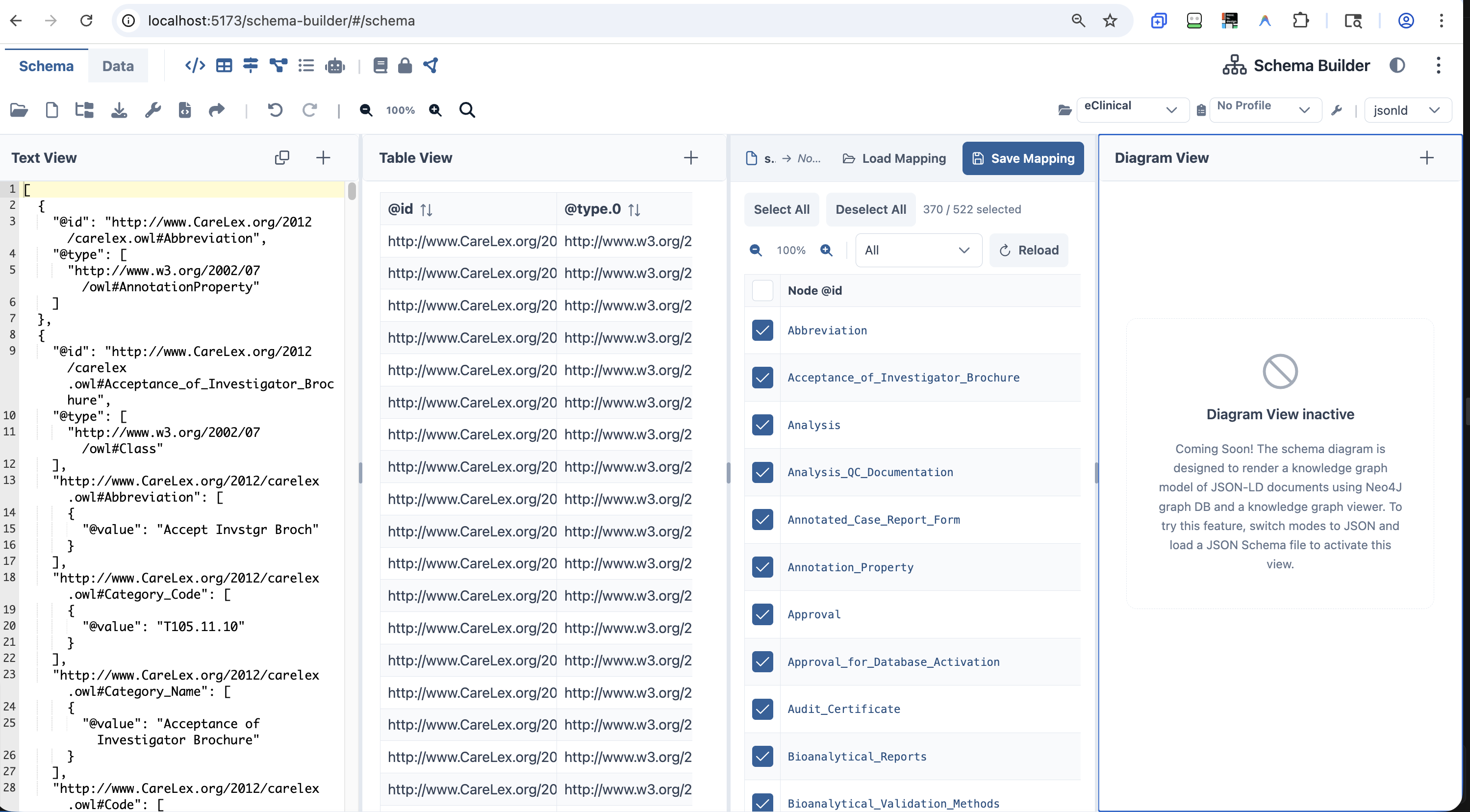 Schema Builder — Schema Mode with Text View, GUI View, Table View, and Mapper View panels open
| # | Icon / Element | Tooltip / Label | Description | Primary Module(s) |
|---|
| 1 | 📂 Folder-open | Open JSON Schema… | Opens schema selection dialog (local file or URL) | components/toolbar/menuItems.ts, components/toolbar/uploadFile.ts |
| 2 | 📄 File icon | New Schema… | Dropdown: Clear Data / Infer Schema from Data | components/toolbar/clearFile.ts, components/toolbar/menuItems.ts |
| 3 | 🌲 Folder-tree | Import Schema… | Dropdown: Import JSON Schema / Import JSON-LD Schema | components/toolbar/importFile.ts, components/toolbar/ImportJsonLdDialog.vue |
| 4 | ⬇ Download | Download Schema | Downloads the current schema as a file | components/toolbar/downloadFile.ts |
| 5 | 🔧 Wrench | Utility… | Dropdown: Extract definitions / Resolve references / Bundle | components/toolbar/extractSchemaDefinitions.ts |
| 6 | </> File-code | Generate Source Code… | Opens code generation dialog | components/toolbar/dialogs/ |
| 7 | ↗ Share | Share Snapshot… | Creates a shareable snapshot URL | components/toolbar/menuItems.ts |
| 8 | │ Separator | — | Visual divider | — |
| 9 | ↶ Rotate-left | Undo | Undoes last edit | data/managedData.ts (UndoManager) |
| 10 | ↷ Rotate-right | Redo | Redoes last undone edit | data/managedData.ts (UndoManager) |
| 11 | │ Separator | — | Visual divider before zoom/search | — |
| 12 | 🔍- | Zoom out | Decreases page zoom by 10% (min 50%) | components/toolbar/TopToolbar.vue |
| 13 | 100% label | — | Current zoom percentage | components/toolbar/TopToolbar.vue |
| 14 | 🔍+ | Zoom in | Increases page zoom by 10% (max 150%) | components/toolbar/TopToolbar.vue |
| 15 | 🔍 | Search (Ctrl+F) | Opens the Search Data & Schema dialog | components/toolbar/SearchDialog.vue |
| 16 | 📁 Project Switcher | — | Selects the active SureCentric project | components/toolbar/ProjectSwitcherCombobox.vue |
| 17 | 📋 CARD Profile | — | Selects the active CARD profile | components/toolbar/CardProfileCombobox.vue |
| 18 | │ Separator | — | Visual divider | — |
| 19 | 🔧 Wrench icon | — | Opens CARD Profile Editor dialog | components/toolbar/dialogs/CardProfileEditorDialog.vue |
| 20 | jsonld dropdown | Active Format | Selects data format: json, yaml, jsonld, xml | dataformats/formatRegistry.ts |
Schema Mode — View Panels
Data Mode — UI Component Map
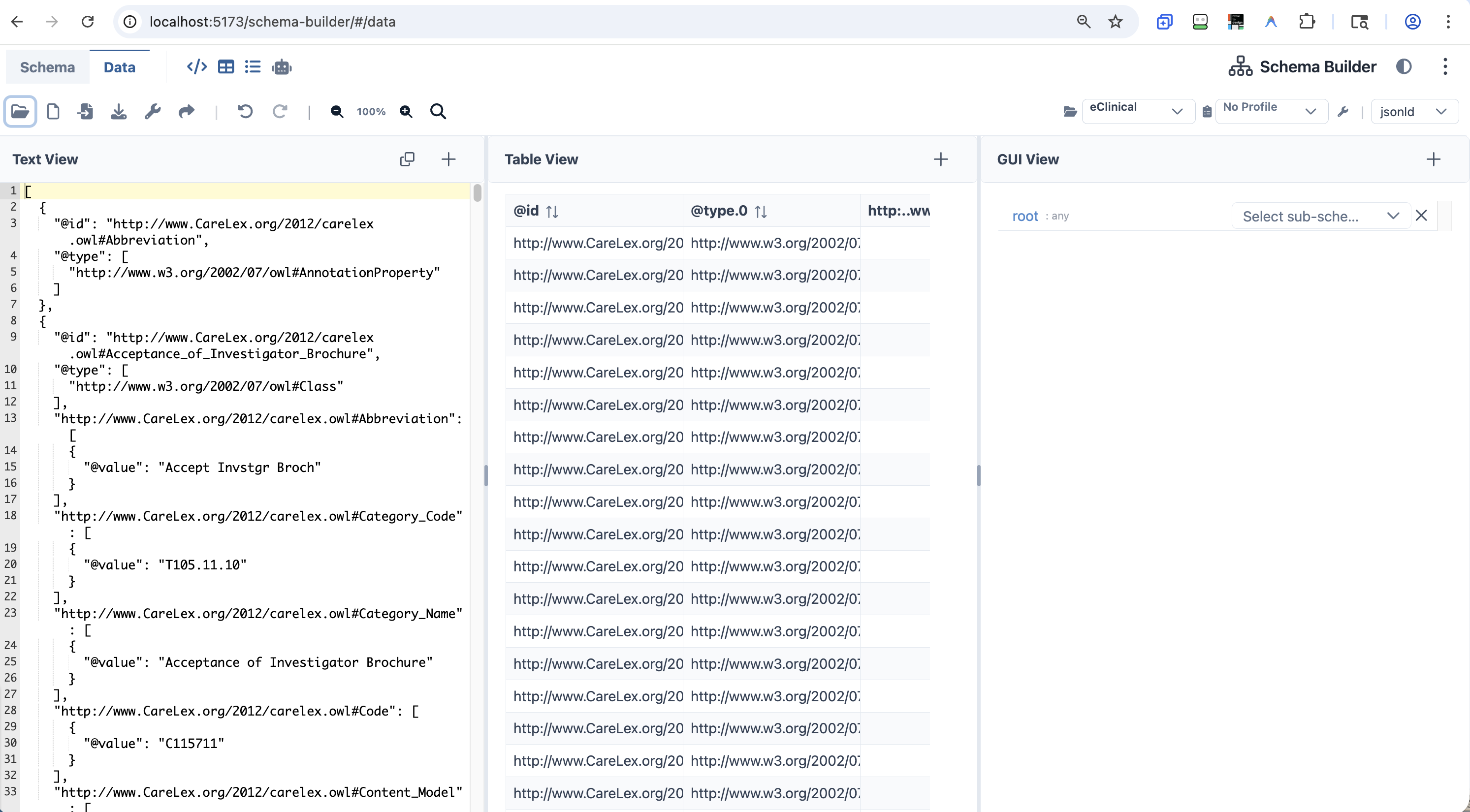 Schema Builder — Data Mode with Text View, Table View, and GUI View panels open
| # | Icon / Element | Tooltip / Label | Description | Primary Module(s) |
|---|
| 1 | Schema tab | — | Switches to Schema Editor mode | components/toolbar/ModeSelector.vue |
| 2 | Data tab | — | Active mode indicator | components/toolbar/ModeSelector.vue |
| 3 | │ Divider | — | Visual separator | — |
| 4 | </> Code icon | Show/Hide Text View | Toggles the Text View panel | components/panels/code-editor/CodeEditorPanel.vue |
| 5 | ⊞ Table icon | Show/Hide Table View | Toggles the Table View panel | components/panels/list-analysis/ListAnalysisPanel.vue |
| 6 | ☰ List icon | Show/Hide GUI View | Toggles the GUI View panel | components/panels/gui-editor/GuiEditorPanel.vue |
| 7 | 🤖 Robot icon | Show/Hide AI Prompts View | Toggles the AI Prompts panel | components/panels/ai-prompts/AiPromptsPanel.vue |
| 8 | ◐ Half-circle icon | Switch to Dark/Light Mode | Toggles dark mode | components/toolbar/TopToolbar.vue |
| 9 | ⋮ Three-dot icon | More options | Opens overflow menu | components/toolbar/TopToolbar.vue |
| # | Icon / Element | Tooltip / Label | Description | Primary Module(s) |
|---|
| 1 | 📂 Folder-open | Open Data | Opens a local data file | components/toolbar/uploadFile.ts |
| 2 | 📄 File icon | New Data… | Dropdown: Clear Data / Generate Data | components/toolbar/clearFile.ts, createSampleData.ts |
| 3 | 📥 File-import | Import Data… | Dropdown: Import CSV Data / Import JSON-LD | components/toolbar/ImportJsonLdDialog.vue |
| 4 | ⬇ Download | Download Data | Downloads the current data file | components/toolbar/downloadFile.ts |
| 5 | 🔧 Wrench | Utility… | Dropdown: Transform Data / Export via Template | components/toolbar/menuItems.ts |
| 6 | ↗ Share | Share Snapshot… | Creates a shareable snapshot URL | components/toolbar/menuItems.ts |
| 7 | │ Separator | — | Visual divider | — |
| 8 | ↶ Undo | Undo | Undoes last edit | data/managedData.ts |
| 9 | ↷ Redo | Redo | Redoes last undone edit | data/managedData.ts |
| 10–15 | Zoom / Search | (same as Schema mode) | Page zoom + search dialog | components/toolbar/TopToolbar.vue |
| 16–20 | Project / CARD Profile / Format | (same as Schema mode) | Context controls | (same as Schema mode) |
Data Mode — View Panels
| Panel | Description | Primary Module(s) |
|---|
| Text View | Full-text data editor with AJV validation annotations | components/panels/code-editor/CodeEditorPanel.vue |
| Table View | Renders data arrays as a sortable, paginated DataTable; auto-selects single arrays | components/panels/list-analysis/ListAnalysisPanel.vue |
| GUI View | Schema-driven form editor; validates user input against schema constraints from Schema Mode | components/panels/gui-editor/GuiEditorPanel.vue |
| AI View | Sends data context to AI for generation, modification, Q&A, and format export | components/panels/ai-prompts/AiPromptsPanel.vue |
Shared Components
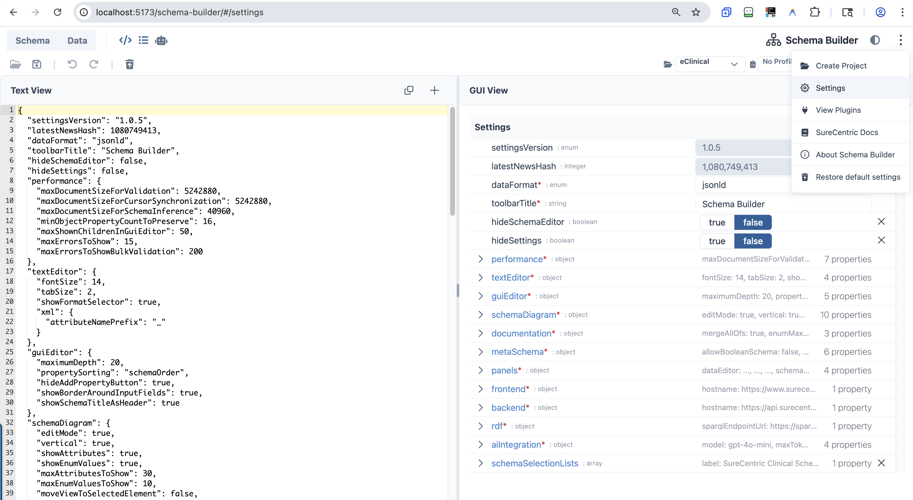 The three-dot overflow menu (left) with the Settings view open (right)
| Menu Item | Icon | Description | Primary Module(s) |
|---|
| Create Project | fa-solid fa-folder-open | Opens the Create/Edit Project dialog | components/toolbar/dialogs/CreateEditProjectDialog.vue |
| Settings | pi pi-cog | Navigates to the Settings editor view | views/SettingsEditorView.vue |
| View Plugins | fa-solid fa-plug | Opens the Plugin Manager dialog | components/toolbar/PluginManagerDialog.vue |
| SureCentric Docs | fa-solid fa-book | External link to https://docs.surecentric.net | — |
| About Schema Builder | pi pi-info-circle | Shows the About dialog | components/toolbar/TopToolbar.vue |
| Restore default settings | fa-solid fa-trash-arrow-up | Resets all settings to defaults | settings/defaultSettingsData.ts |
Settings
Access: ⋮ overflow menu → Settings
Source: views/SettingsEditorView.vue · settings/defaultSettingsData.ts · settings/settingsSchema.ts · settings/settingsTypes.ts
The Settings view renders Schema Builder's own configuration as a two-panel editor (Text View + GUI View) in Settings mode. Settings are persisted to localStorage as a JSON document validated against the settings JSON Schema. Changes take effect immediately.
Restore defaults: ⋮ → Restore default settings resets all values to SETTINGS_DATA_DEFAULT and reloads the app.
Root-Level Settings
| Setting | Type | Default | Description |
|---|
settingsVersion | string | "1.0.5" | Internal version — read-only |
dataFormat | json | yaml | xml | jsonld | "jsonld" | Default format in the code editor |
toolbarTitle | string | "Schema Builder" | Title shown in the app toolbar |
hideSchemaEditor | boolean | false | Hides the schema editor mode entirely |
hideSettings | boolean | false | Hides the settings mode entirely |
| Setting | Type | Default | Description |
|---|
maxDocumentSizeForValidation | integer | 5,242,880 (5 MiB) | Documents larger than this (bytes) skip AJV validation |
maxDocumentSizeForCursorSynchronization | integer | 5,242,880 (5 MiB) | Documents larger than this skip panel cursor sync |
maxDocumentSizeForSchemaInference | integer | 40,960 (40 KiB) | Documents larger than this are trimmed before schema inference |
minObjectPropertyCountToPreserve | integer | 16 | Min property count preserved when trimming large documents |
maxShownChildrenInGuiEditor | integer | 50 | Max children shown per node in the GUI Editor |
maxErrorsToShow | integer | 15 | Max validation errors displayed |
maxErrorsToShowBulkValidation | integer | 200 | Max errors shown during bulk validation |
textEditor — Code Editor
| Setting | Type | Default | Description |
|---|
fontSize | integer (10–40) | 14 | Font size in the code editor |
tabSize | integer (1–8) | 2 | Tab width in the code editor |
showFormatSelector | boolean | true | Shows JSON / YAML / XML / JSON-LD format dropdown |
xml.attributeNamePrefix | string | "_" | Prefix added to XML attribute names on export |
guiEditor — Visual Editor
| Setting | Type | Default | Description |
|---|
maximumDepth | integer (1–20) | 20 | Max depth rendered inline; deeper nodes require click-navigation |
propertySorting | enum | "schemaOrder" | priorityOrder: required→optional→additional. schemaOrder: matches schema definition order. dataOrder: matches data object order |
hideAddPropertyButton | boolean | true | Hides the "Add custom property" button for schema-undefined keys |
showBorderAroundInputFields | boolean | true | Adds a visible border around input fields |
showSchemaTitleAsHeader | boolean | true | Shows schema title as a header above the field |
schemaDiagram — Diagram View
| Setting | Type | Default | Description |
|---|
editMode | boolean | true | Click elements in the diagram to edit the schema |
vertical | boolean | true | Renders diagram top-to-bottom (vs. left-to-right) |
showAttributes | boolean | true | Shows property attributes in diagram nodes |
showEnumValues | boolean | true | Shows enum values in diagram nodes |
maxAttributesToShow | integer | 30 | Max attributes shown per node before truncation |
maxEnumValuesToShow | integer | 10 | Max enum values shown per node before truncation |
moveViewToSelectedElement | boolean | false | Auto-pans the diagram to the selected element |
automaticZoomMaxValue | number | 1 | Max zoom level when auto-panning |
automaticZoomMinValue | number | 0.5 | Min zoom level when auto-panning |
mergeAllOfs | boolean | false | Merges allOf sub-schemas in the diagram |
documentation — Documentation View
| Setting | Type | Default | Description |
|---|
mergeAllOfs | boolean | true | Merges allOf sub-schemas in generated docs |
enumMaxCountToShowWithoutSpoiler | integer | 10 | Enum values above this count collapse behind a spoiler |
repeatMultipleOccurrencesInTableOfContents | boolean | true | Repeated schema references all appear in the table of contents |
| Setting | Type | Default | Description |
|---|
allowBooleanSchema | boolean | false | Allows true/false as valid sub-schema definitions |
allowMultipleTypes | boolean | false | Allows a property to have multiple types (e.g., string | number) |
objectTypesComfort | boolean | true | Forces consistent types for default, const, enum, examples to enable auto-type-selection |
markMoreFieldsAsAdvanced | boolean | true | Hides less-common schema fields behind an "Advanced" toggle |
showAdditionalPropertiesButton | boolean | false | Shows a button to add properties outside the schema definition |
showJsonLdFields | boolean | true | Shows JSON-LD fields (@context, @type, @id) in the schema editor |
panels — Layout Configuration
| Setting | Type | Default | Description |
|---|
dataEditor | Panel[] | [textEditor 33%, tableView 33%, guiEditor 33%] | Panels shown in Data Mode |
schemaEditor | Panel[] | [textEditor 25%, tableView 25%, mapperView 25%, schemaDiagram 25%] | Panels shown in Schema Mode |
settings | Panel[] (read-only) | [textEditor 50%, guiEditor 50%] | Panels shown in Settings Mode — cannot be changed in the UI |
hidden | string[] | ["debug", "test"] | Panel types hidden from toolbar toggles. Valid values: aiPrompts, debug, test, schemaDiagram, guiEditor, textEditor, tableView, documentation |
Each panel entry has: panelType (guiEditor \| textEditor \| schemaDiagram \| aiPrompts \| tableView \| documentation), mode (schemaEditor \| dataEditor \| settings), and size (percentage ≥ 10).
aiIntegration — AI API
| Setting | Type | Default | Description |
|---|
model | string | "gpt-4o-mini" | Model ID — supports OpenAI, Perplexity Sonar, OpenRouter provider/model, and custom deployments |
maxTokens | integer | 5000 | Max tokens per AI request |
temperature | number (0.0–1.0) | 0.0 | Sampling temperature; 0 = fully deterministic |
endpoint | string (URI) | "https://api.openai.com/v1/" | OpenAI-compatible API endpoint (Azure OpenAI, SureLLM, Ollama, OpenRouter all work) |
rdf — Ontology / SPARQL
| Setting | Type | Default | Description |
|---|
sparqlEndpointUrl | string (URI) | "https://sparql.carelex.org" | SPARQL endpoint for ontology lookups and NCBO autocomplete |
frontend / backend — Host Configuration
| Setting | Type | Default | Description |
|---|
frontend.hostname | string (URI) | "https://www.surecentric.net" | Frontend server hostname — used in link generation |
backend.hostname | string (URI) | "https://api.surecentric.net" | Backend API hostname |
schemaSelectionLists — Schema Picker
| Setting | Type | Default | Description |
|---|
schemaSelectionLists | SchemaSelectionList[] | SureCentric eClinical entry | Groups shown in the schema selection dialog |
[].label | string | "SureCentric Clinical Schemas" | Group label shown in the dialog |
[].schemas | URI or SchemaEntry[] | eClinical/CareLex entry | Remote list URL or inline schema entries |
[].schemas[].label | string | "eClinical Content Model (CareLex)" | Schema display name |
[].schemas[].url | string (URI) | GitHub raw URL to eclinical-v1-test.jsonld | Schema source URL |
Dialogs
| Dialog | Trigger | Description | Primary Module(s) |
|---|
| Schema Selection | Open JSON Schema… | Select from schema store, URL, or file upload | components/toolbar/fetchExampleSchemas.ts |
| Search | 🔍 icon / Ctrl+F | Full-text search across data and schema with result navigation | components/toolbar/SearchDialog.vue |
| Import JSON-LD | Import JSON-LD menu item | Multi-step JSON-LD import with merge/replace options | components/toolbar/ImportJsonLdDialog.vue |
| Plugin Manager | View Plugins menu item | Lists registered plugins with activate/deactivate toggles | components/toolbar/PluginManagerDialog.vue |
| Create/Edit Project | Create Project menu item | Creates or edits a SureCentric project | components/toolbar/dialogs/CreateEditProjectDialog.vue |
| CARD Profile Editor | 🔧 icon (profile combobox) | Edits CARD profiles: schemas, datasets, plugins, visualization apps | components/toolbar/dialogs/CardProfileEditorDialog.vue |
Panel Infrastructure
Theming & Styling
UI Framework Stack
| Technology | Version | Purpose |
|---|
| TailwindCSS | ^3.3.2 | Utility-first CSS; darkMode: 'class' in tailwind.config.js |
| PrimeVue | ^4.2.5 | Vue 3 component library — registered globally in main.ts |
| @primevue/themes | ^4.2.5 | PrimeVue Lara theme preset — customized with SureCentric brand palette |
| PrimeIcons | ^7.0.0 | pi pi-* icon classes — used in overflow menu and panel settings |
| FontAwesome | ^6.5.2 | Primary toolbar icon set — registered in fontawesome.ts |
| Ace Editor | bundled via vue3-ace-editor | Text/code editor component |
PrimeVue Lara Theme — SureCentric Brand Palette
The theme is defined in main.ts using definePreset() to extend the Lara base preset.
SureCentric Blue (#29619B, HSL 211°, 58%):
| Token | Hex |
|---|
50 | #ebf2fa |
100 | #d7e5f4 |
200 | #aecbea |
300 | #7eacdd |
400 | #4a8acf |
500 (brand primary) | #29619B |
600 | #225081 |
700 | #1b3f65 |
800 | #132d49 |
900 | #0d1e30 |
950 | #07121c |
This palette is applied in two places:
- PrimeVue preset — maps to
semantic.primary and colorScheme.light/dark
- Tailwind config — remaps
colors.indigo to the same palette
Dark Mode
| Mechanism | Details |
|---|
| Toggle trigger | TopToolbar.vue → toggleDarkMode() toggles html.dark class on <html> |
| Persistence | localStorage key sc-color-mode ('dark' or 'light') |
| PrimeVue selector | darkModeSelector: '.dark' in theme options (main.ts) |